Browse, Shortlist, and plan —You Love Yours on the Responsive website
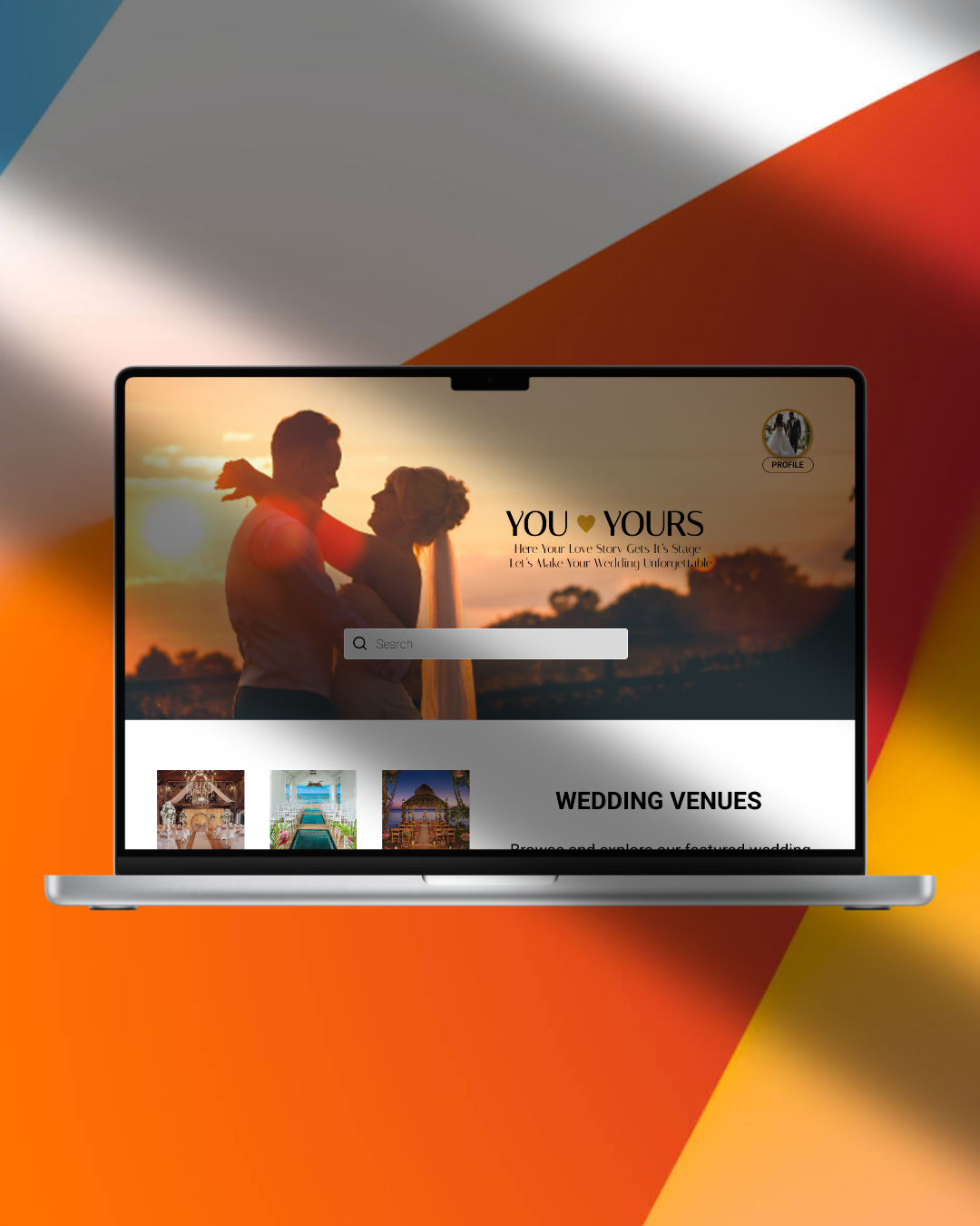
Problem
Users browsing wedding venues on the web struggle to understand where to start and how to move between venue discovery, login, and bookings due to unclear content structure.
User Goal
Users want a clear and simple way to explore venues, access their account, and manage bookings within one responsive website.
Information Architecture & Navigation Structure
The website structure was designed around core user actions such as venue discovery, booking management, and profile settings. Instead of traditional menu-heavy navigation, the layout prioritizes task-based access.
High-Level Structure
A simplified sitemap was created to organize primary actions and define relationships between sections.
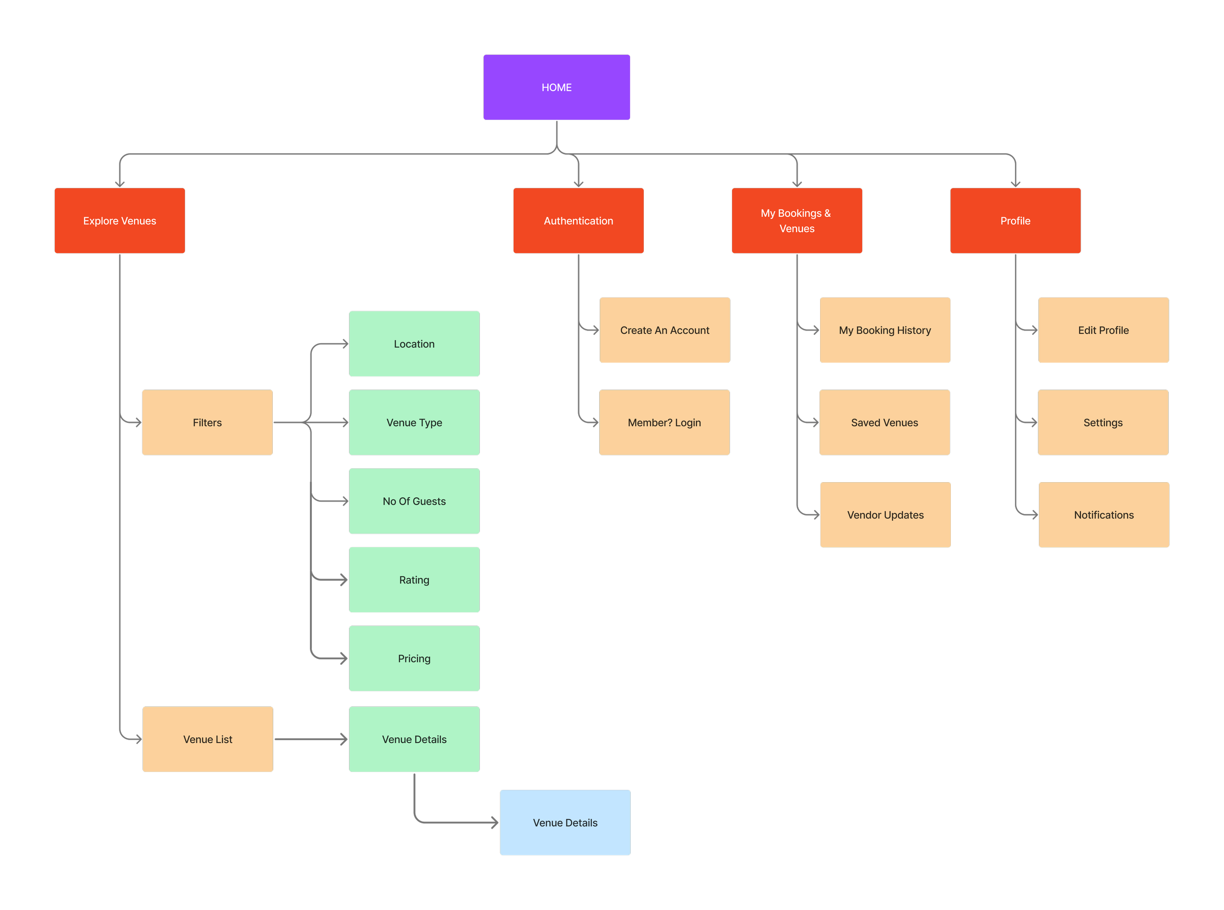
High-level structure showing exploration, authentication, booking management, and profile flows.
Section-Based Navigation
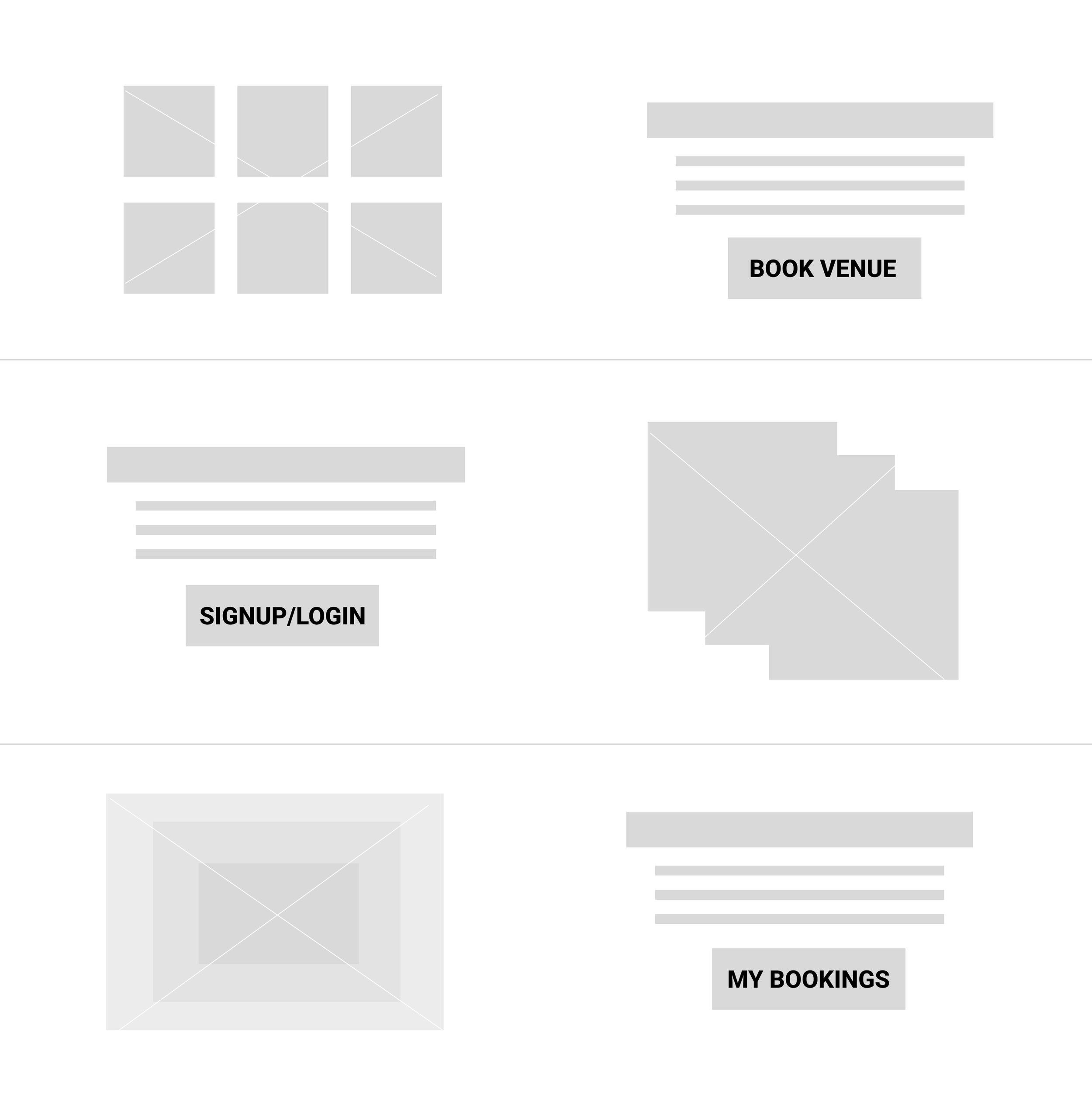
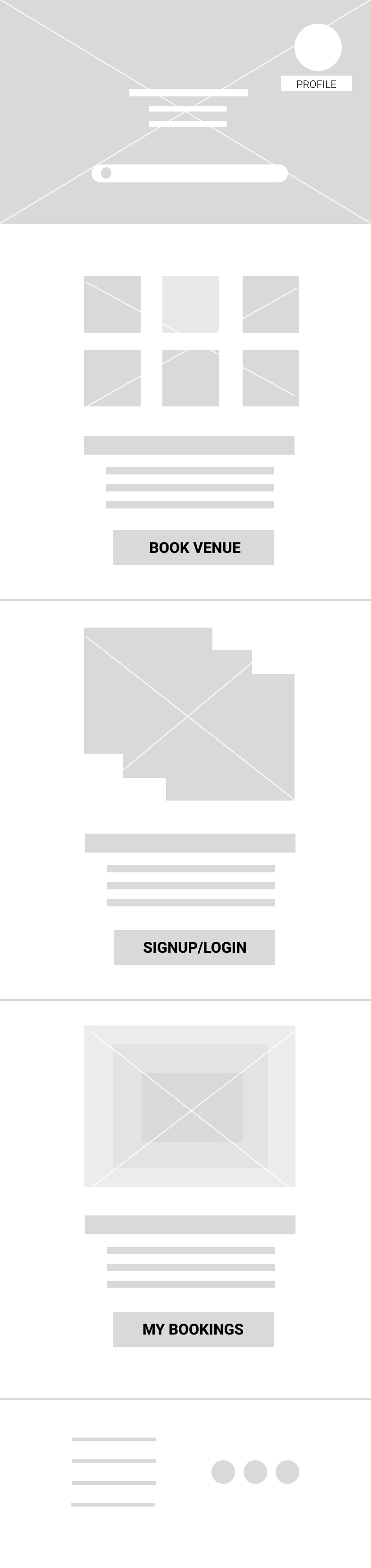
The homepage presents three primary task areas as structured content blocks.
Each section contains a short description and a clear call-to-action button, allowing users to navigate directly without relying on traditional top navigation.
Select Venues
Sign Up / Login
My Bookings & Saved Venues
Profile Access
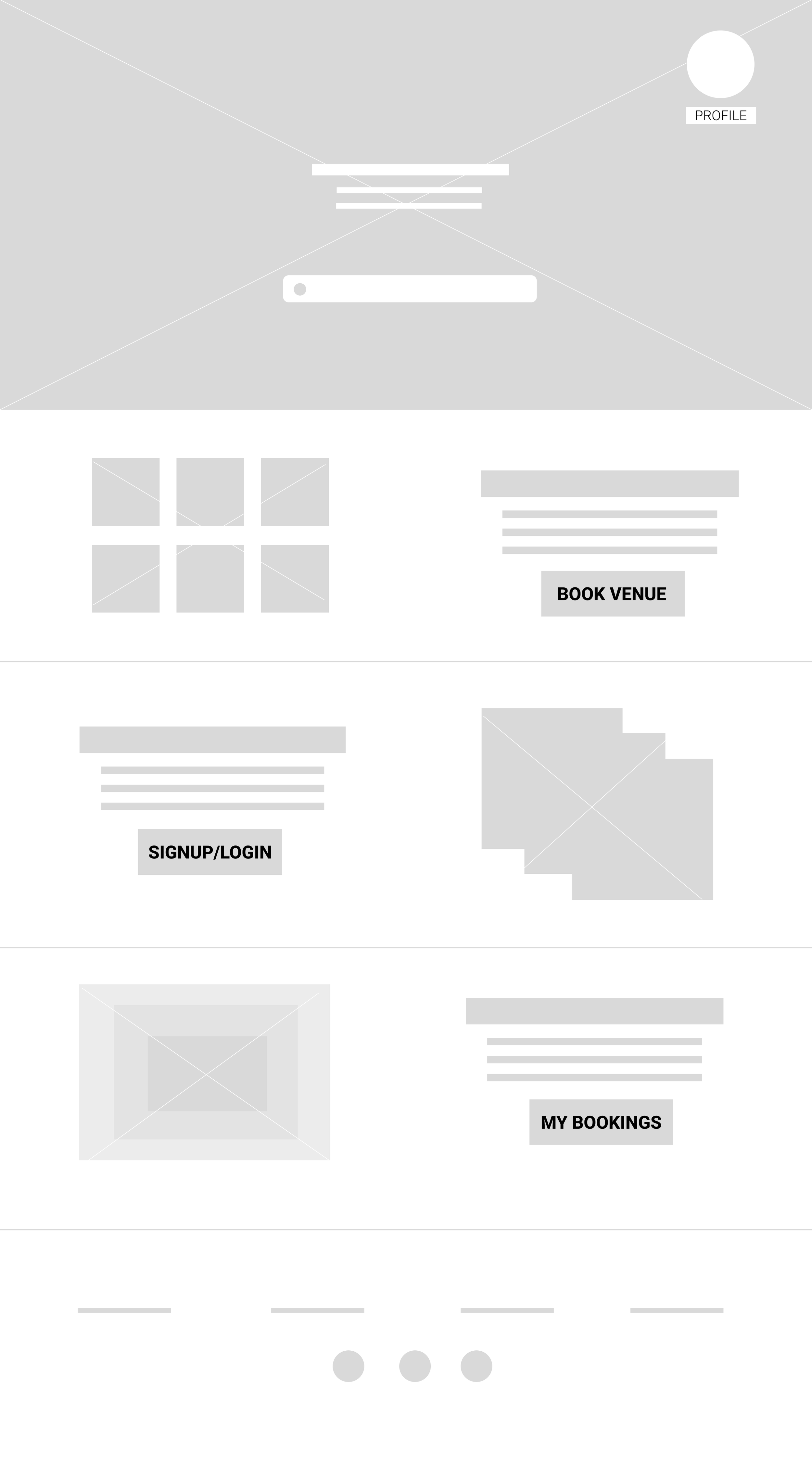
Profile settings are separated from task-based flows and accessed through a circular icon at the top of the interface. This keeps the main page focused on exploration and booking actions while maintaining easy account access.


Why This Structure Works
The task-based structure creates clarity, reduces complexity, and allows users to move through the website with confidence.
Responsive Strategy
Layout Changes Across Devices
On desktop, sections are arranged with side-by-side imagery and text to utilize horizontal space.
On mobile, the same sections stack vertically to support natural scrolling and readability.
Structural Consistency & Interaction Adaptation
The core sections Wedding Venues, Create Account, and Saved Venues
— remain consistent across desktop and mobile. While the layout adapts to different screen sizes, the overall structure and navigation logic do not change.
Typography, spacing, and button sizing adjust based on screen width to maintain readability and usability. Primary call-to-action buttons remain visually dominant and easily clickable across devices.
Final UI Screens
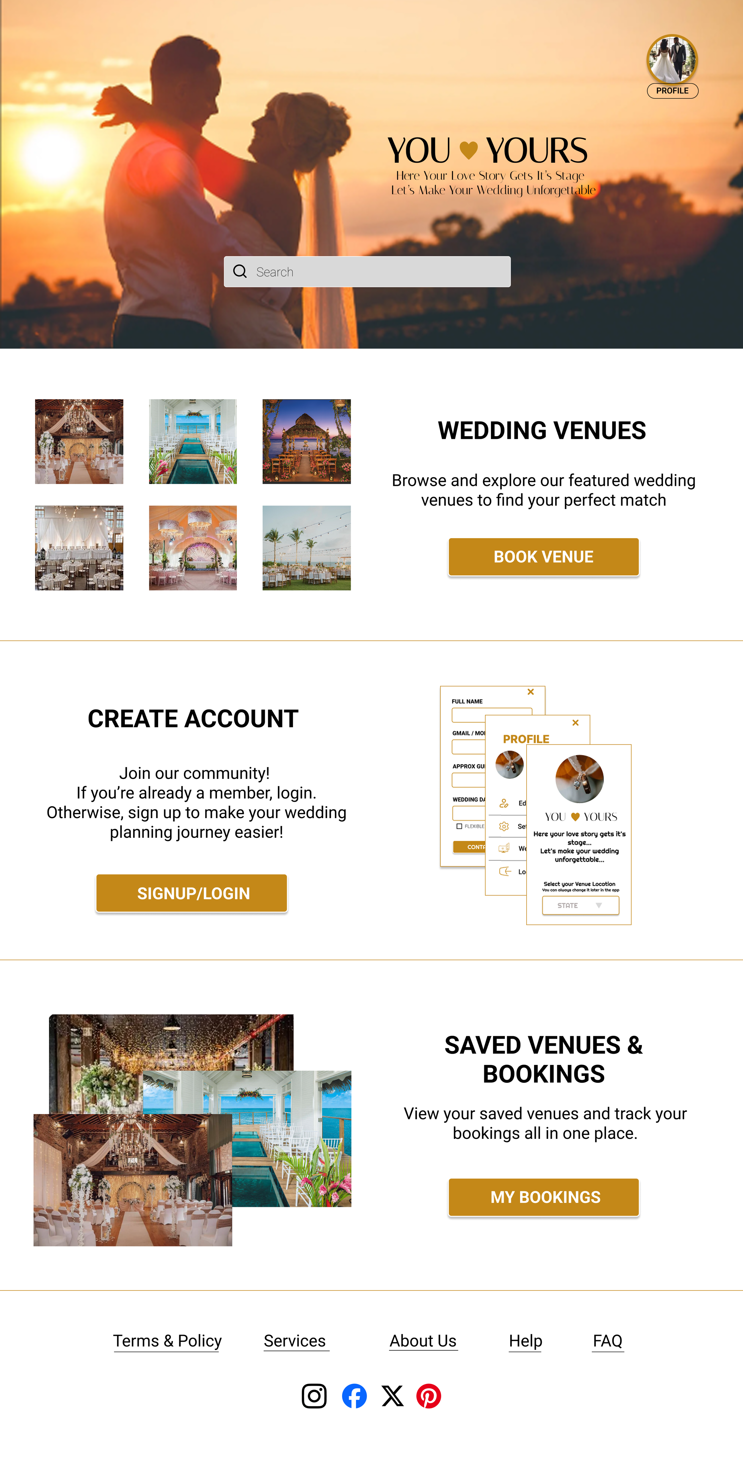
The final interface reflects the section-based navigation strategy and responsive structure defined earlier.
Home Page
Clear entry points. Defined user paths.

Venue List
Scan. Compare. Decide.


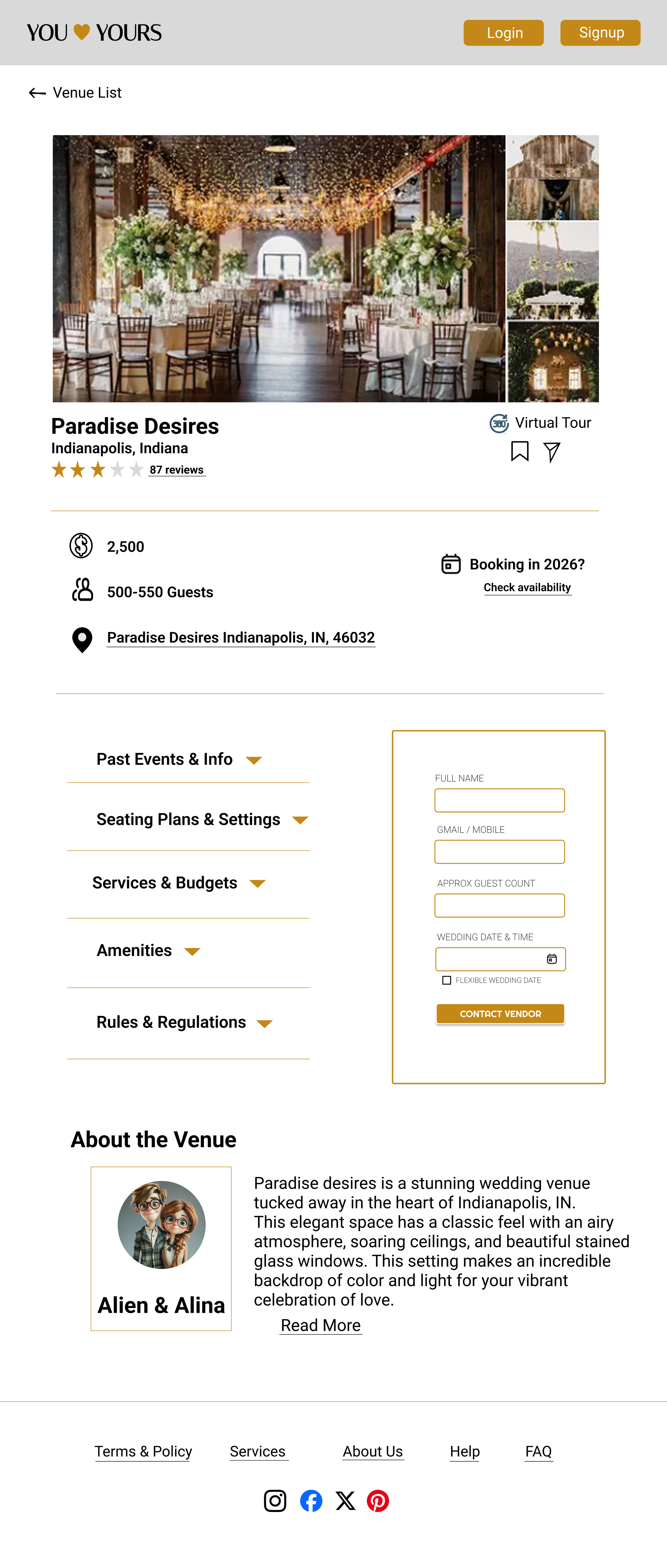
Venue Details
Essential information, prioritized.

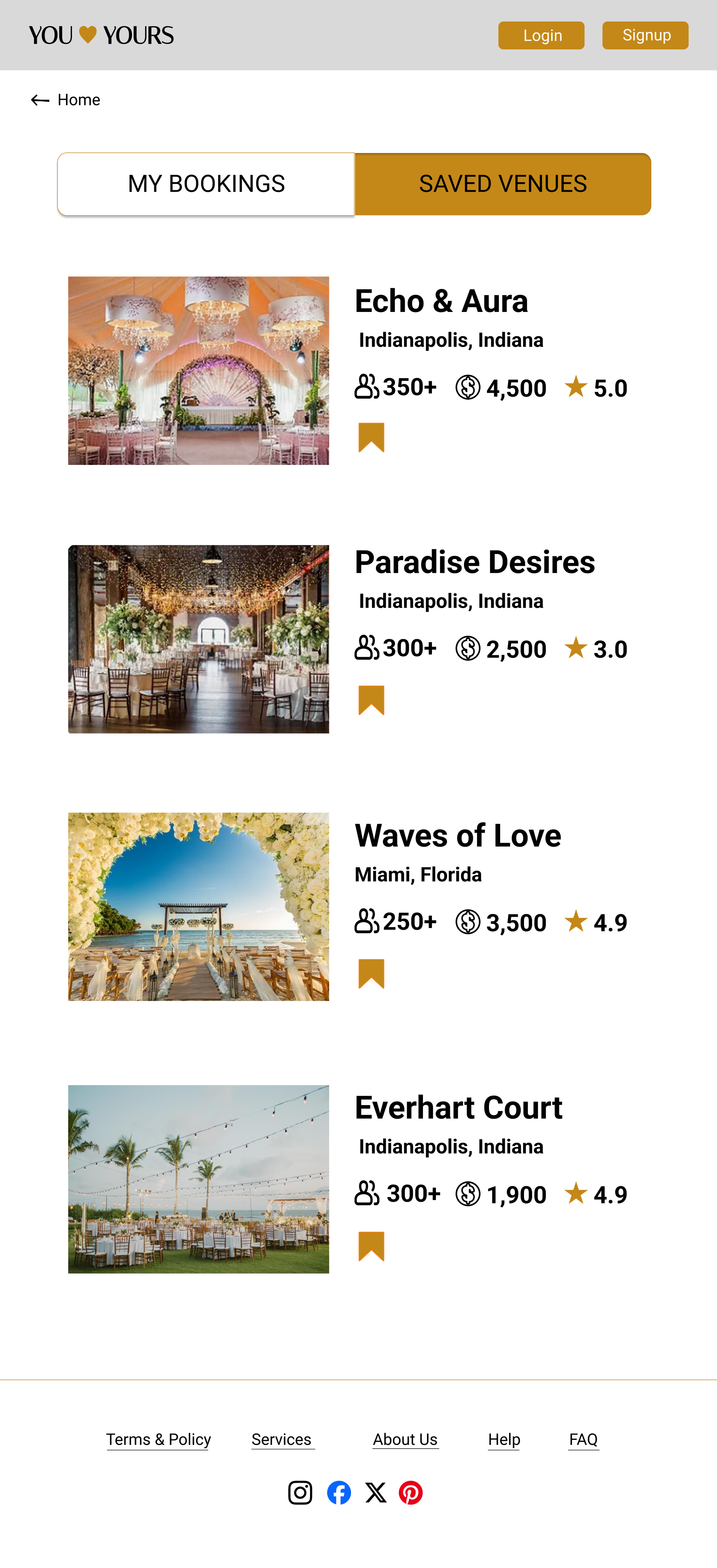
My Bookings & Saved Venues
Organized. Accessible. Simple.

Interactive Prototype
The prototype validates clear task progression, ensuring users can navigate confidently between primary sections without confusion.
Reflection & Learnings
This project reinforced my focus on designing structured, responsive interfaces that guide user intent through clear hierarchy, intentional layout decisions, and consistent interaction patterns.
Responsive adaptation should preserve structure, not redesign the experience.
Limiting navigation complexity improves overall clarity.
Clear information architecture significantly reduces navigation friction.
Section-based navigation simplifies complex workflows.