Local Bond
Local Community Platform for Meaningful Neighborhood Connections.
(Mobile app & Responsive Website)
The Challenge
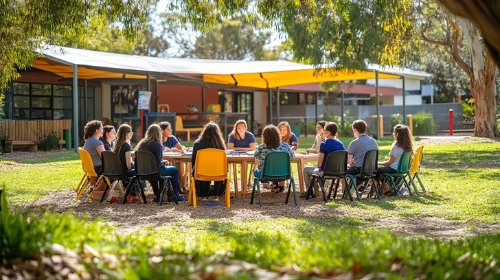
Despite living close to one another, many neighbors remain socially disconnected.
International residents seek familiarity.
Many individuals also look to connect with people of similar age groups or shared interests.
Communities lack structured platforms for local discovery and support.
How might we design a secure and intentional system that helps neighbors connect meaningfully within the same community?
Understanding Community Behavior
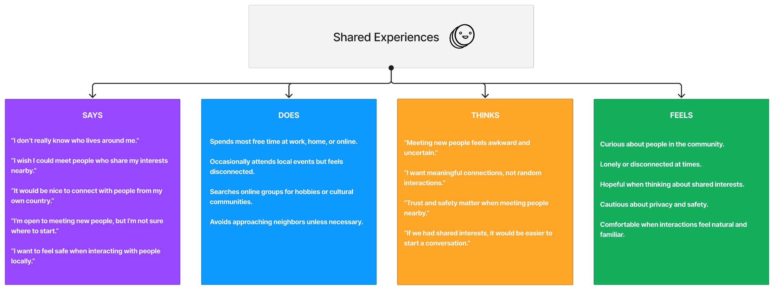
To understand social hesitation and connection barriers, I conducted interviews and mapped behavioral and emotional patterns.
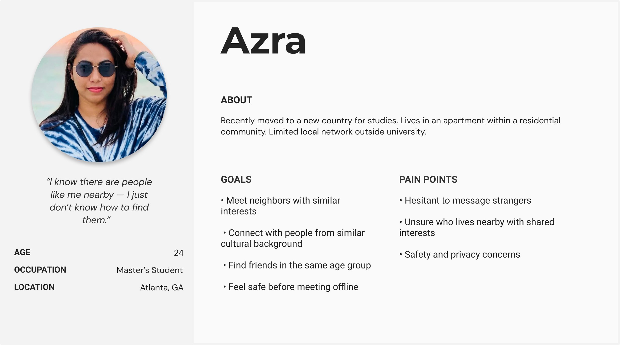
Represents users seeking belonging and cultural comfort within their local environment.
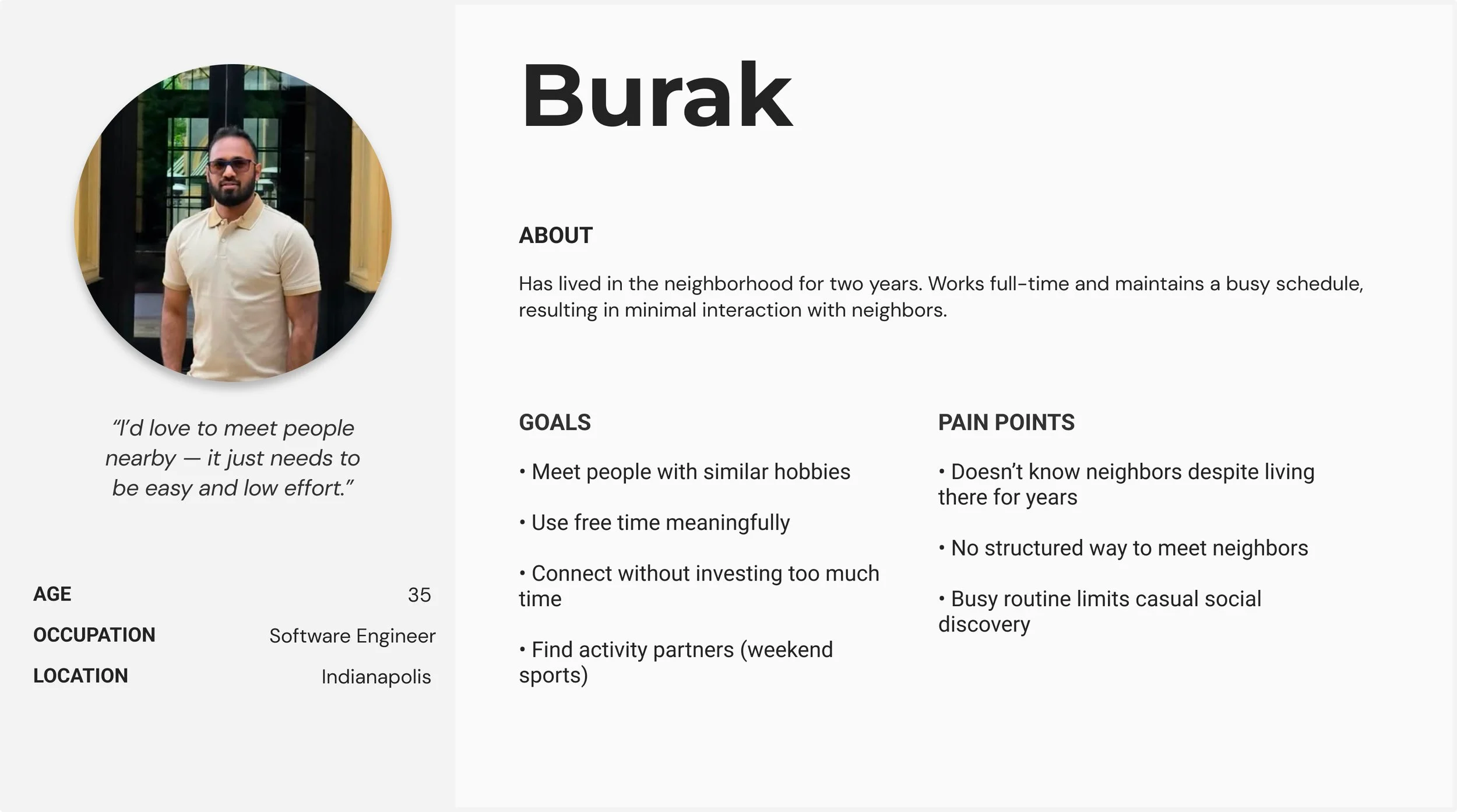
Represents users who value structured, low-effort ways to connect locally.
Defining the Core Problem
Despite living in close proximity, many neighbors remain socially disconnected. Residents lack a secure and structured system to discover shared interests, connect with similar age groups, and build trusted local relationships. As a result, opportunities for meaningful interaction and community support remain untapped within the same neighborhood.
Ideation & Concept Exploration
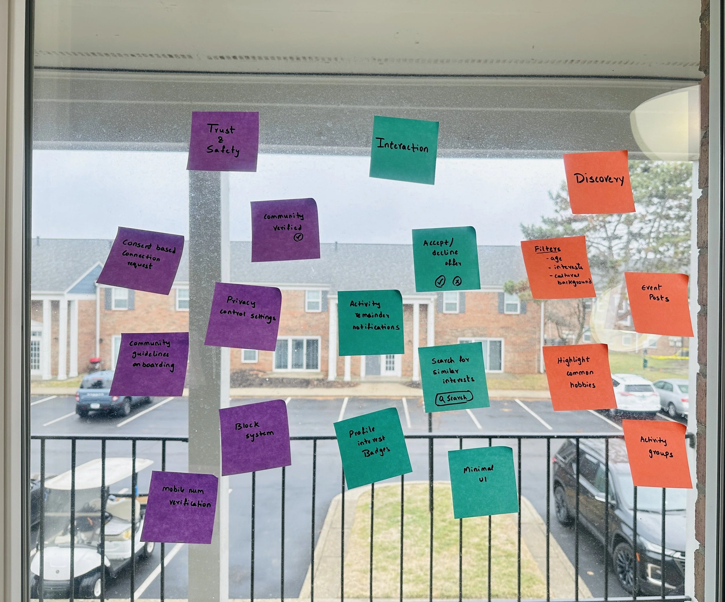
Through collaborative brainstorming and rapid ideation, Ideas were grouped around.
Trust & Safety
Interaction
Discovery
Information Architecture & Cross-Platform Structure
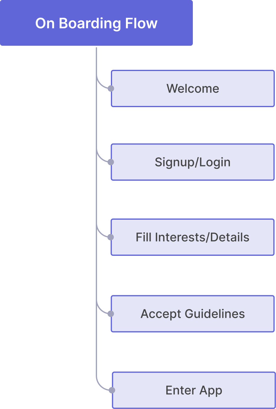
The system was designed mobile-first, recognizing that neighborhood interactions and real-time engagement are most likely to occur on-the-go.
Mobile IA (Detailed Structure)

The mobile architecture prioritizes task clarity within limited screen space.
Four core pillars — Discover, Events, Support, and Profile — structure the experience while embedding trust, privacy, and connection management at key interaction points.
Website IA (Expanded Visibility Structure)

By separating connection management and introducing a centralized dashboard, the desktop experience enhances organization while maintaining consistency with the mobile core structure.
Key Interaction Flows
To ensure structural clarity, core interaction journeys were mapped before moving into detailed wireframes.
Flow 01 —
Interest-Based Connection
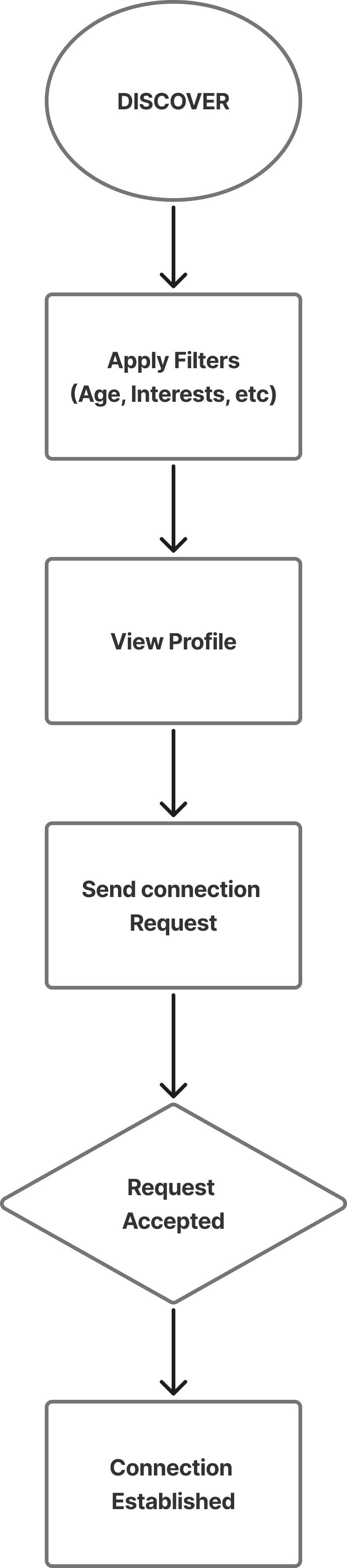
This flow prioritizes intentional discovery while maintaining consent-based connection approval.
Flow 02 —
Create & Join Event
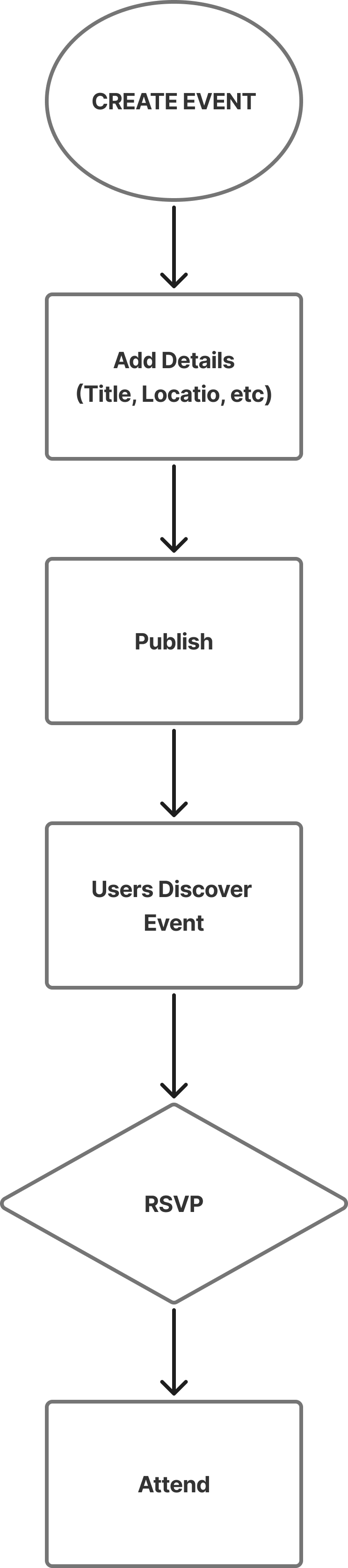
Event interactions were structured to interest-based community participation with clear intent and visibility.
Flow 03 —
Emergency Support Request
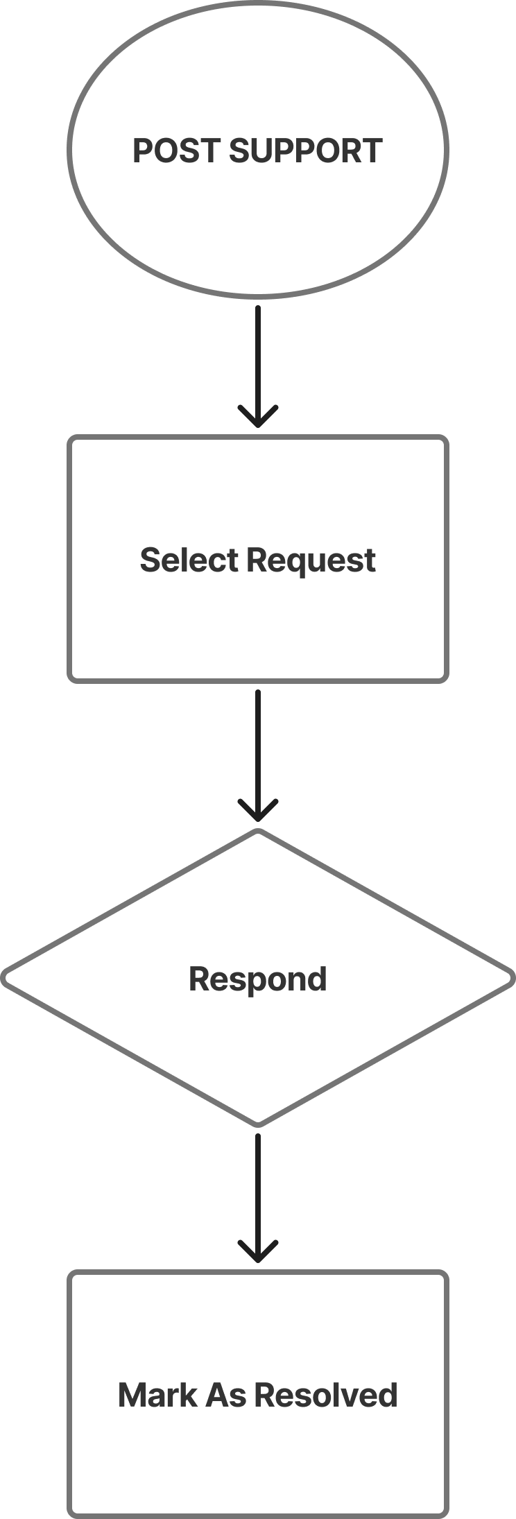
Enable users to respond to support requests posted by others in a simple, trust-based way.
From Paper to Digital
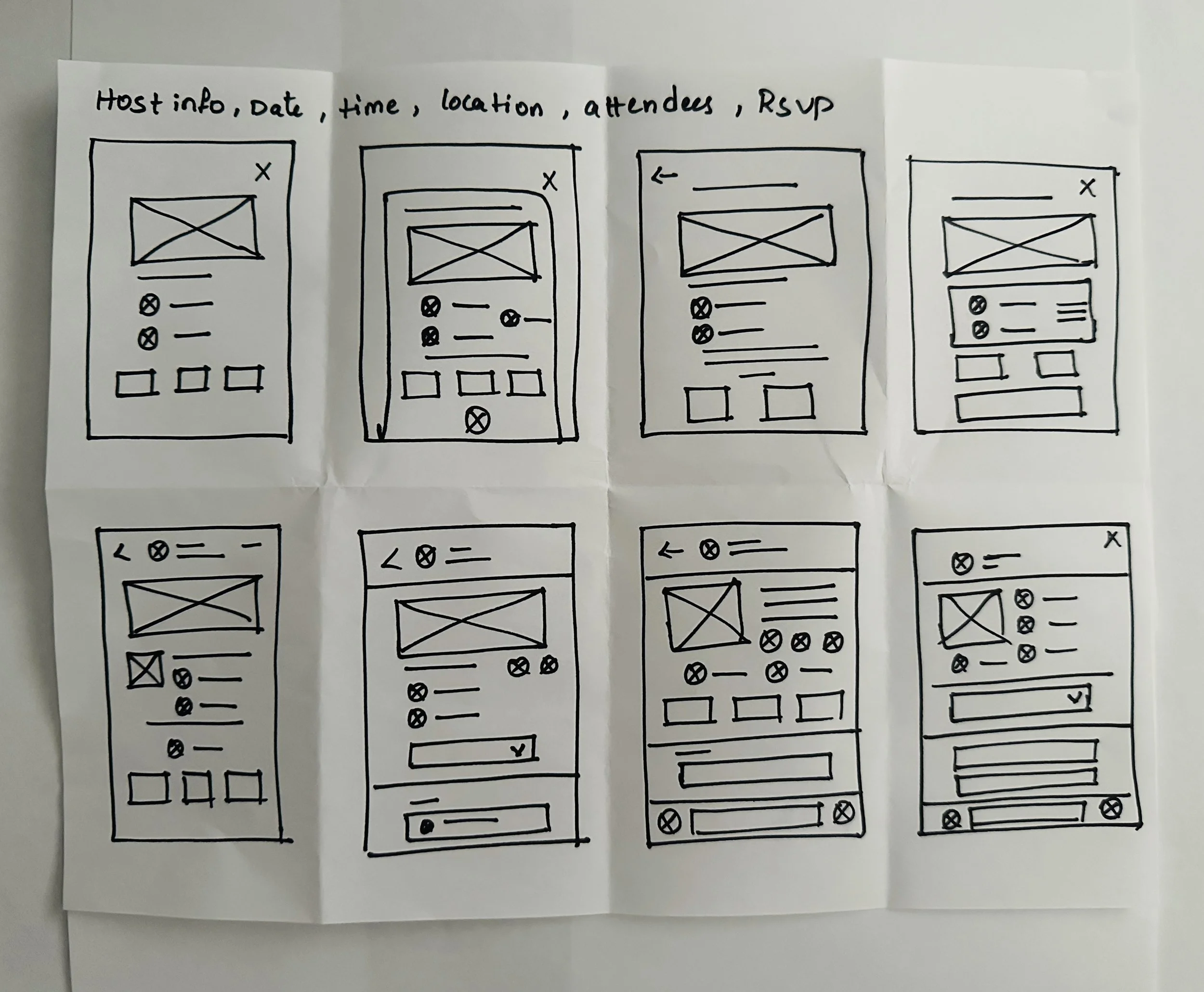
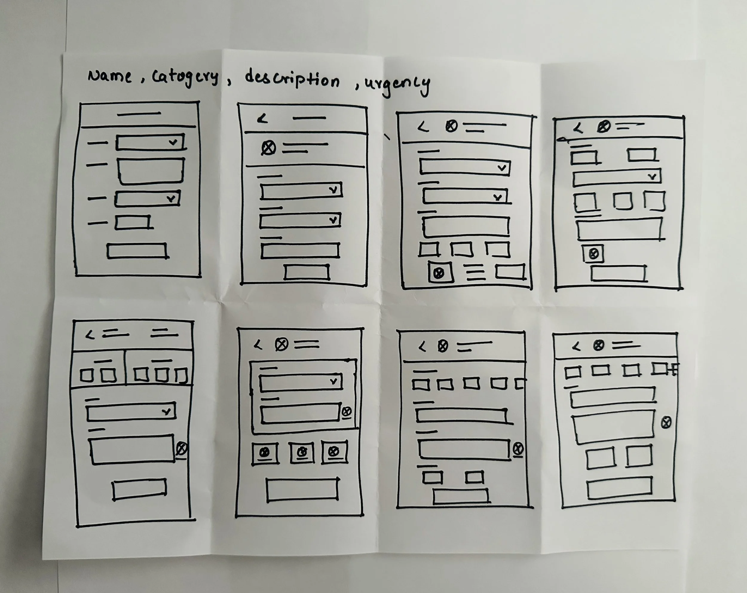
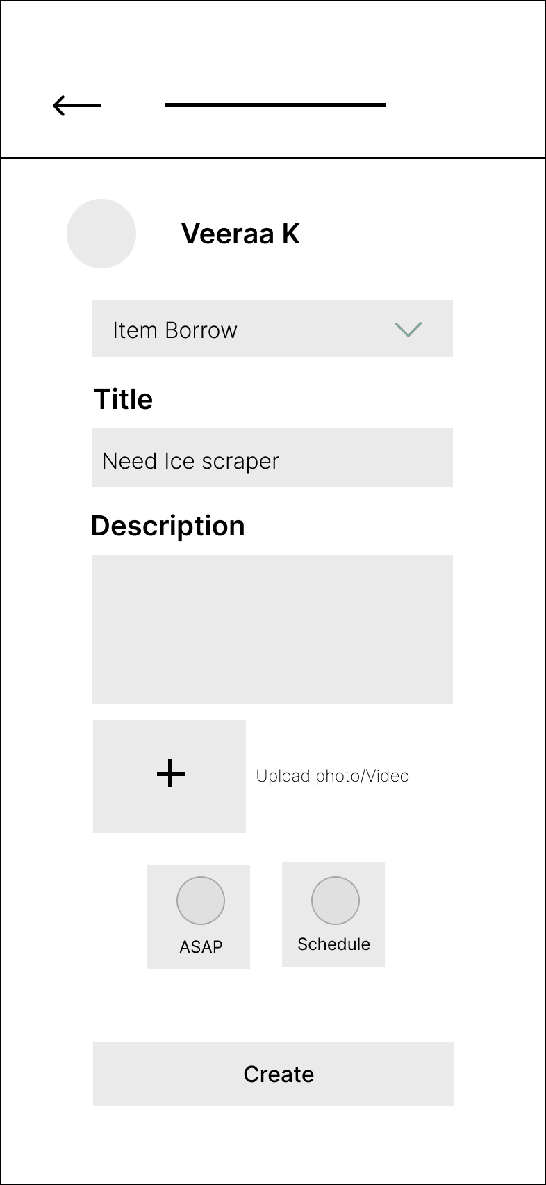
I began with quick paper sketches to explore layout hierarchy, navigation patterns, and content grouping.
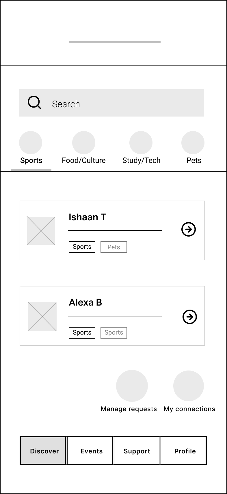
Interest based Connections

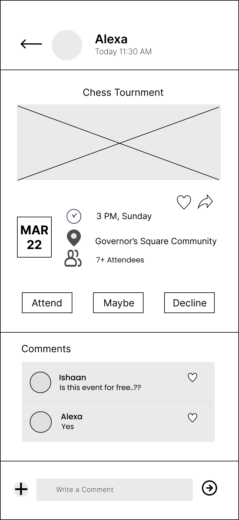
Create/View Events
Create/View Support Requests
Final Product Design & Strategic Decisions
Design Decision
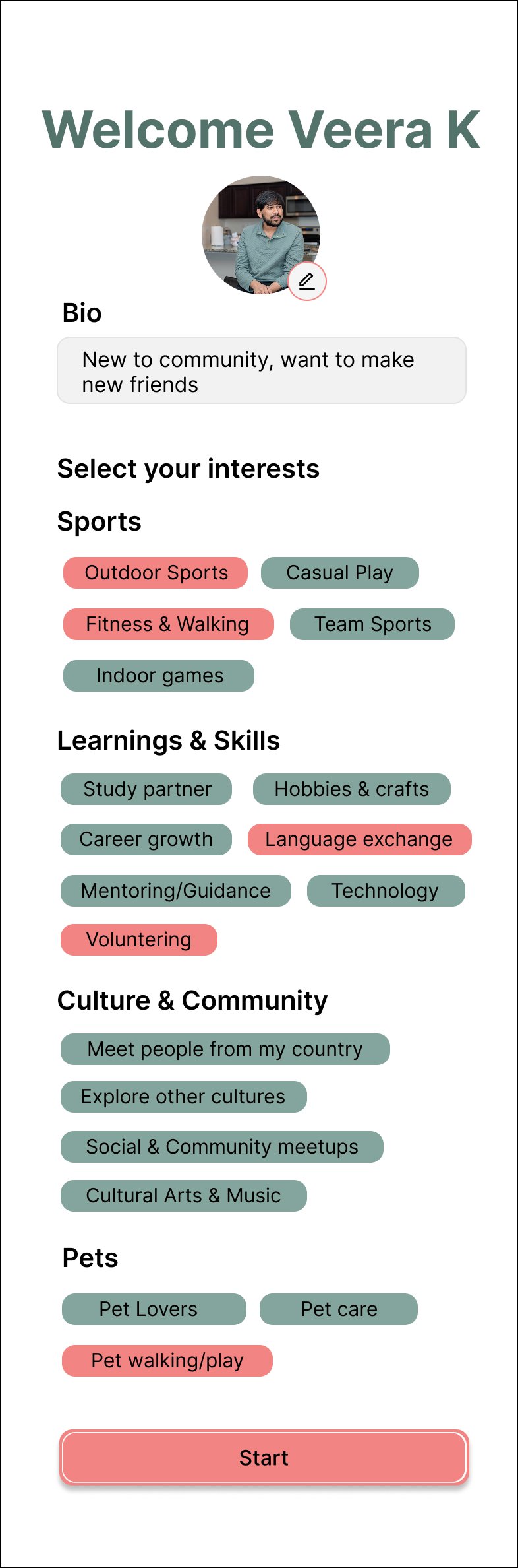
Interests are structured into clear sections and sub lists considering all age groups.
Interaction Highlight
Selected interests are visibly highlighted, giving users immediate confirmation and control.
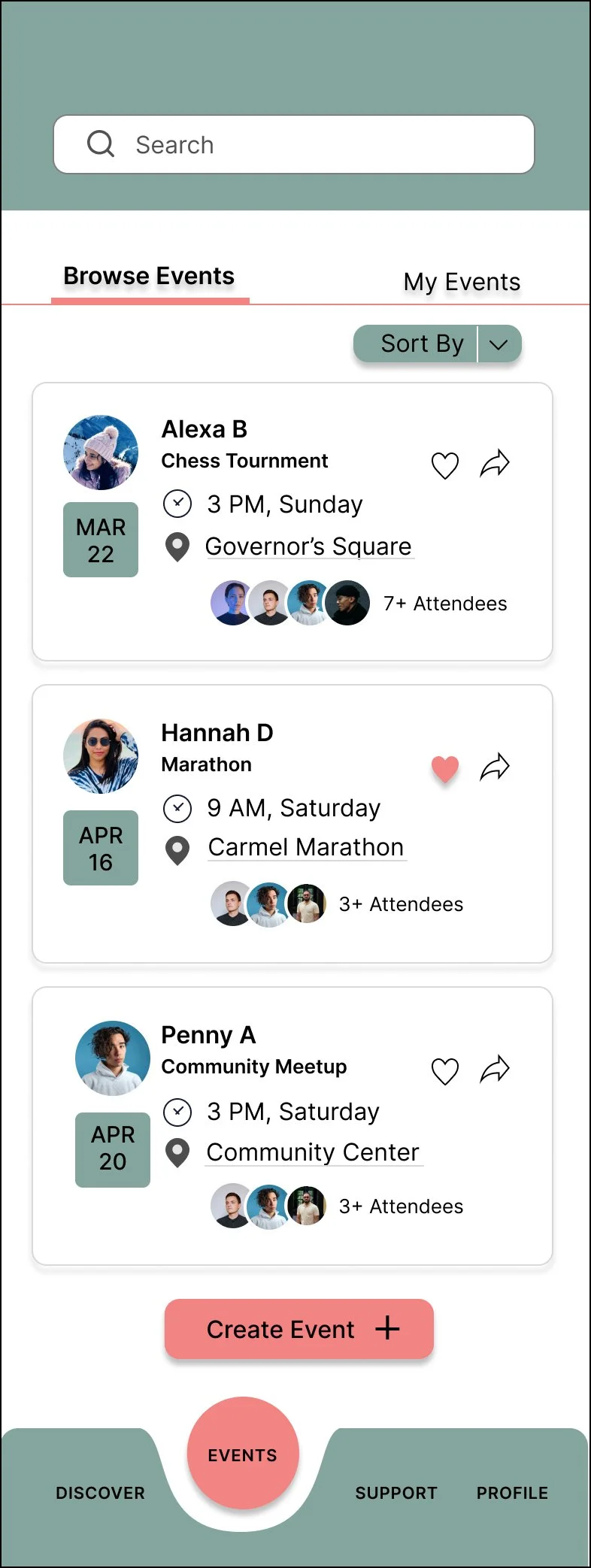
Design Decision
The date block creates strong visual structure and improves quick chronological recognition.
Interaction Highlight
The shadow effect establishes clickability. It provides an immediate visual cue that invites interaction, enhancing the overall feel of the app.
Design Decision
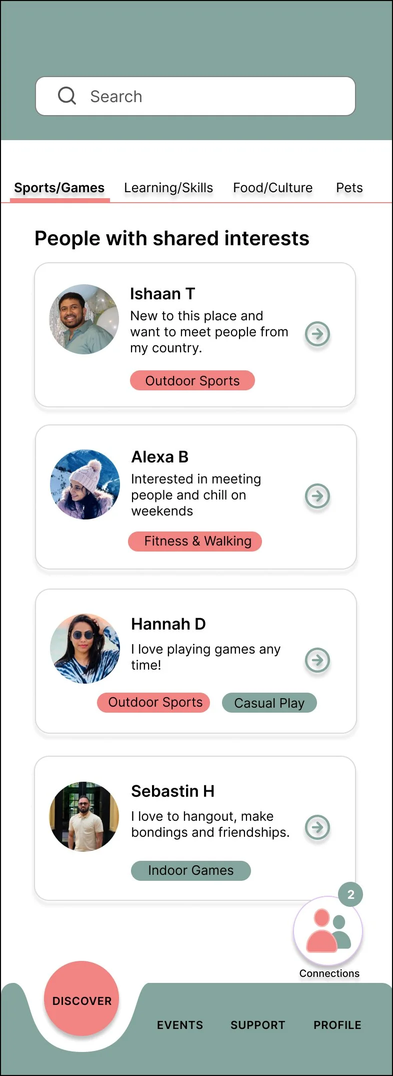
Search and category filtering are placed prominently to help users quickly narrow shared interests in a diverse community.
Interaction Highlight
Mutual interests are visually surfaced within profile cards to create instant connection triggers.
Design Decision
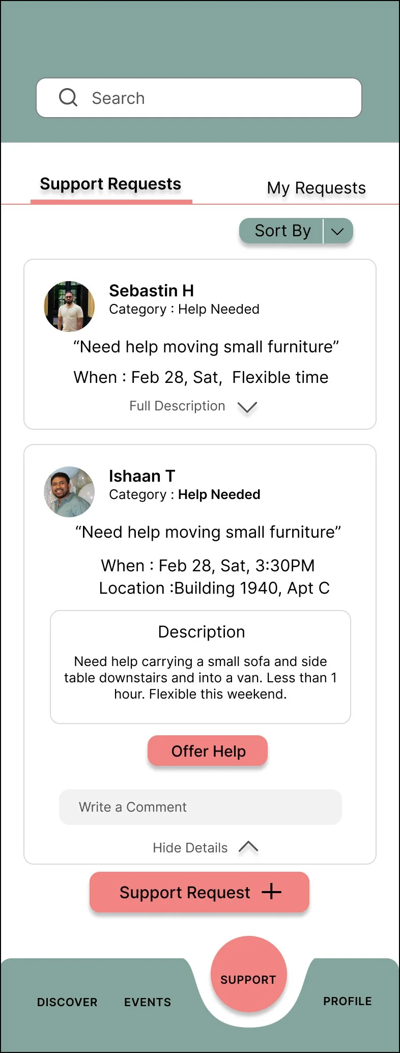
Expanded layout allows users to evaluate full event context before confirming attendance.
Interaction Highlight
Support requests expand within the feed to maintain urgency context and reduce interaction steps.
Design System & Component Library
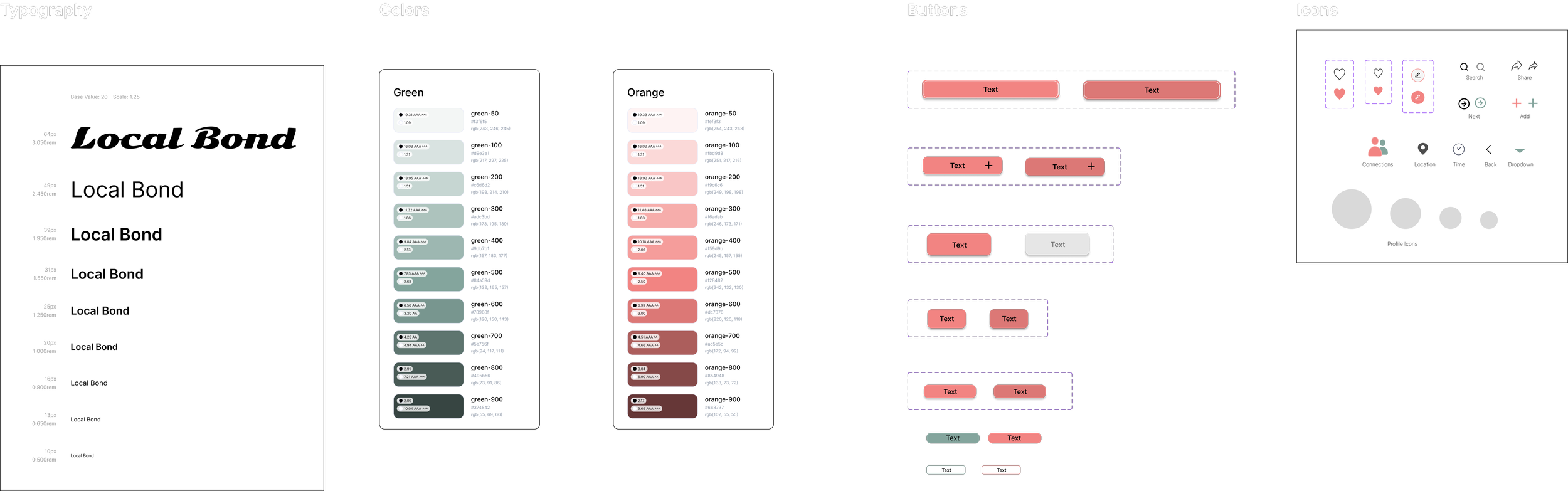
To ensure consistency, scalability, and cross-platform alignment, a reusable design system was created for Local Bond. The system supports both mobile and responsive web while maintaining visual and interaction consistency.
Final UI & Key User Journeys (Mobile & Web)
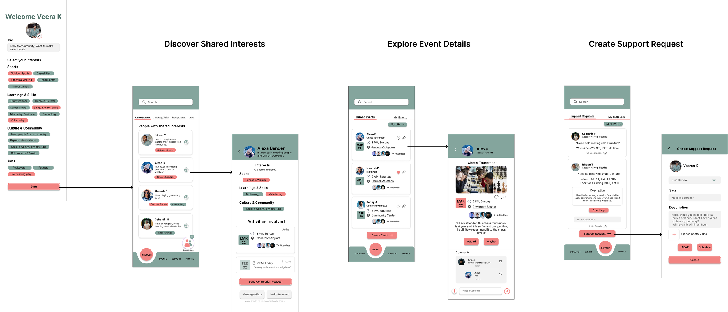
• Designed around real community needs — helping users discover people, attend events, and offer support easily.
• Clear and simple navigation — core actions like Discover, Events, and Support are accessible within one tap.
• Focused on meaningful interactions — layouts prioritize profiles, interests, and community activities instead of clutter.
• Mobile-first thinking — optimized for quick, on-the-go usage while maintaining consistency in the responsive web version.
• Reduced cognitive effort — information is structured into cards and clear sections so users can scan and act quickly.
Part A: Mobile — Core Flow
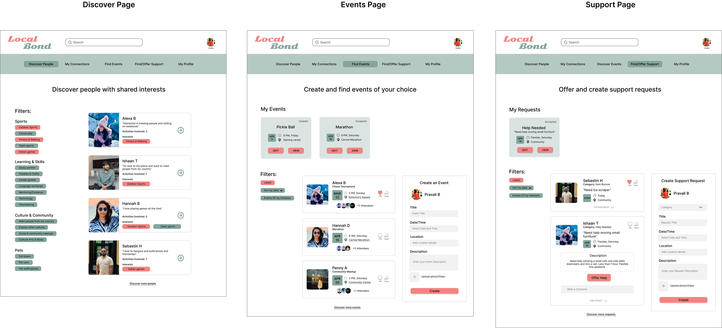
Part B: Responsive Web Adaptation
Accessibility Considerations
Screen reader friendly structure
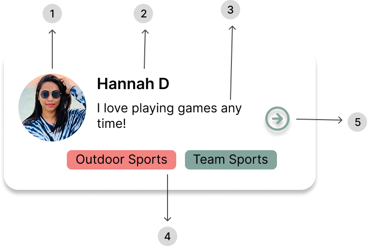
Profile cards follow a logical screen reader order including image alt text, profile information, interests, and action buttons to ensure assistive technologies communicate the content clearly.
Screen Reader Reading Order (Profile Card)
Profile photo — Alt text: “Profile photo of Hannah D”
Name — Hannah D
Description — “I love playing games anytime.”
Interests — Outdoor Sports, Team Sports
Action button — “Open user profile”
Color Contrast for Readability
Color contrast was designed following WCAG readability guidelines to ensure text remains clearly visible against background surfaces. Dark foreground text on light backgrounds improves readability for users.
Dark text on light background
WCAG readability considered
Clear visibility across devices

Clear Information Hierarchy
The interface follows a clear hierarchy by separating primary navigation actions from content filters, helping users easily understand where to navigate and how to refine results.
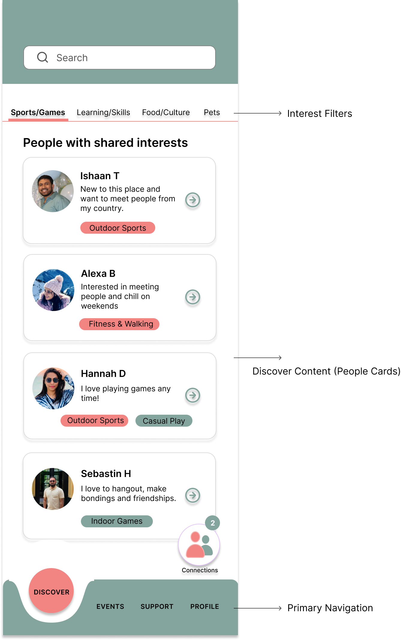
Clear navigation hierarchy
Logical grouping of actions
Reduced cognitive effort for users
Icons with Text Labels
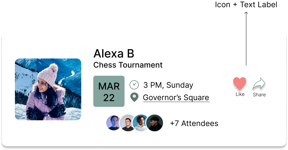
Icons are paired with clear text labels to ensure actions are easily understood by all users, including those who may not recognize icon meanings.
Icon + Text Label
Clear meaning for all usersAccessible Navigation
Icons supported with readable labels
Final Reflection
Designing Local Bond reinforced the importance of simple, user-centered design when building products for diverse communities. I focused on creating an experience that makes discovering people, events, and support within a neighborhood clear and easy to navigate.
A key learning from this project was the value of accessibility in design. Considering screen reader structure, readable contrast, clear hierarchy, and labeled navigation helped ensure the interface is usable for a wider range of users.
This project strengthened my approach to designing intuitive, inclusive experiences that prioritize real user needs and meaningful community interaction.